Global Warming Stopped in 1998
Global warming denialists like to say that global warming stopped in 1998. Is it true? No. The warming trend continues. To understand this, one needs to understand that there is a difference between weather and climate. Weather is short term and climate is long term. The long term trend is clear. We are continuing to warm.
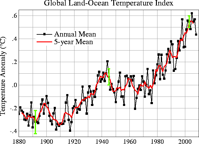
Global Land-Ocean Temperature Index 2008
NASA – What’s the Difference Between Weather and Climate?
This myth is interesting because it is using a temperature peak that occurred in 1998 to show that we are cooling since then.
That peak was riding on top of the warming trend caused by global warming and occurred during an El Nino event, which is a warming related event. This event occurred while the PDO (Pacific Decadal Oscillation) was in positive phase. If you add up the PDO with El Nino on top of the global warming rising trend, you can see how such a spike could occur.
Take a look at the chart to the right and ask yourself this:
- Did the 30 year long cooling trend from 1880 to 1910 stop global warming?
- Did the 33 year long cooling trend from 1943 to 1976 stop global warming?
- Do you think a 10 year long trend is significant in this context?
When you consider current forcing and the natural variability forcing range, obviously not.
The global mean temperature when tracked over time establishes the trend line. The difference between climate and weather is simple. Weather is short term and climate is long term.
But there are two 30 year long cooling trends?
When considering the trends you also need to examine attribution. Attribution is the ‘what caused it question’. In other words, what attributes explain the cooling or warming.
The general theories on these to cooling trends is that the first one, 1880 to 1910, was still largely natural variation. This is because the human forcing component was still not yet strong enough.
The second cooling period occurred just after WWII when large scale industrialization began. This introduced aerosols to the atmosphere on a large scale, which caused a negative forcing. This may have countered some of the positive forcing that was occurring at that time.
Nasa: The difference between weather and climate.
Essentially the trend is up; and then we got an El Nino riding on top of the mean increase. That caused an unusually high temperature spike because the El Nino was riding on top of the Global Warming wave, so to speak.
Even though the temperature was high in 1998, that does not mean it was the highest temperature in the multi-year trend.
The highest temperature in the trend, as per the above graph, is indicted by the peak in 2005.
The recent lull in warming is a part of natural variability most reasonably attributed to the fact that we are at the bottom of the Schwabe cycle and have been in La Nina which contributes to cooling rather than El Nino Warming.
Important Note:
Natural variability is occurring but it is occurring on the human caused global warming trend. Sort of like a drunk driver that took a different road. So there is still a lot of wavering and weaving, but the road is in a different direction… in this case the road is a warming trend.
According to NASA, the new Sunspot cycle began in November of 2008. It usually takes 5 and a half years to reach solar maximum.
A note about our current position in solar cycle 24:
Solar cycle 24 began in early 2009. The sun, in solar cycle 23, experienced an extended solar minimum similar to that of 1913. At a solar minimum, the total positive forcing is only +1.6W/m2 instead of +1.8W/m2. Of course both these numbers are far above the natural cycle and the natural forcing.
Do 10 years really make a difference?
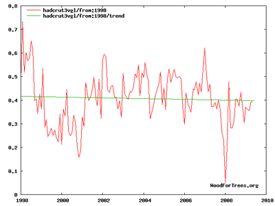
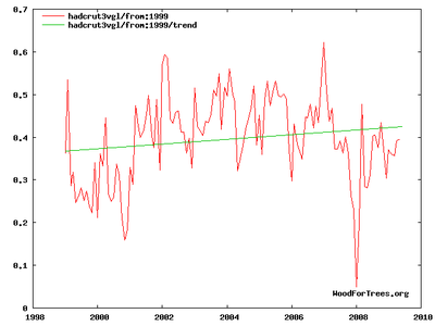
Consider the difference between 1998 to 2008 and the following graph of 1999 to 2009. What becomes immediately clear is that one shows a downtrend and one shows an uptrend. Simply put, cherry-picking the time frame is a misresentation of the overall trend.
Trend 1998-2008
Trend 1999-2009
By cherry-picking 1998 as a start point, which happened to be an el Nino year, which is warmer than usual, they misled the public.
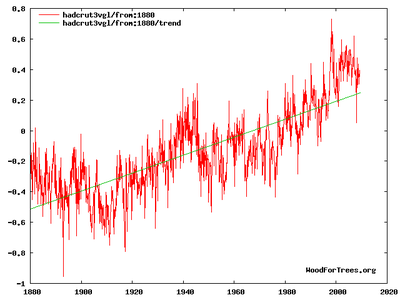
Looking at the trend since 1880 gives a lot more data points and reduces short term variance. Thus you can see the overal trend much more clearly through time. It is dishonest to use short term variability to represent long term trends.
Global Annual Mean Surface Air Temperature Change
Here we see the updated graphs. Clearly, as expected based on the science, global warming did not stop in 1998.


Line plot of global mean land-ocean temperature index, 1880 to present, with the base period 1951-1980. The dotted black line is the annual mean and the solid red line is the five-year mean. The green bars show uncertainty estimates. [This is an update of Fig. 1A in Hansen et al. (2006).]
Figure also available as PDF, or Postscript. Also available are tabular data.
Source: https://data.giss.nasa.gov/gistemp/graphs_v3/
Graph: https://data.giss.nasa.gov/gistemp/graphs_v3/Fig.A2.gif
The simple fact is:
Short term trends are not significant indicators of climate but rather show short term variability within the long term climate trend.
Links
Document Actions


