Ocean Cooling
Did the ocean actually start cooling and global warming stop? The data showed that the Atlantic had gone cold. But the scientist that was looking at the data knew that the inertia of the system should not allow such a thing to happen. But there it was… in the data. Knowing the models and the forces involved he did some more investigating and found something… he looked at his wife and said “Oh, no,”. What’s wrong?” his wife asked? He replied, “I think ocean cooling isn’t real.”
Josh Willis – Oceanographer – NASA/JPL
Josh Willis is an oceanographer at NASA’s Jet Propulsion Laboratory who specializes in sea level trends and the response of the oceans to global warming. (Photograph courtesy Josh Willis.)
Correcting Ocean Cooling
https://earthobservatory.nasa.gov/Features/OceanCooling/
On a Thursday evening in February 2007, Josh Willis stood in front of his laptop, his wife cajoling him to get ready to go out to dinner. He looked with a sinking feeling at the map he had just made. Willis, a scientist at NASA’s Jet Propulsion Laboratory, specializes in making estimates of how much heat the ocean stores from year to year.
The ‘Speed Bump’
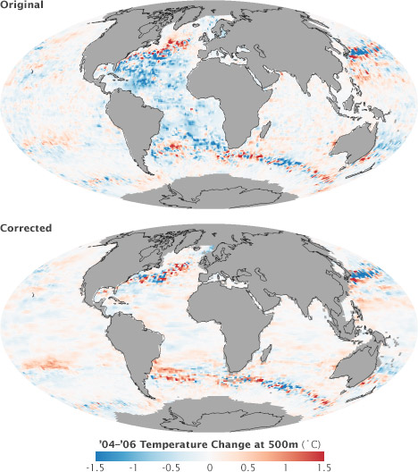
“According to the float data on his computer screen, almost the entire Atlantic Ocean had gone cold. Unless you believe The Day After Tomorrow, Willis jokes, impossibly cold.”
The myth and facts about the “speed bump”
“Oh, no,” he remembers saying.
“What’s wrong?” his wife asked.
“I think ocean cooling isn’t real.”
A Second Opinion
https://earthobservatory.nasa.gov/Features/OceanCooling/page2.php
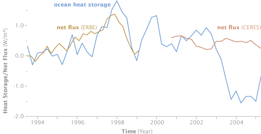
From 1993 to 2003, measurements of heat storage in the oceans agreed with satellite observations of net flux. After 2003, however, surface observations suggested that the ocean was losing heat, while satellite measurements of net flux showed the Earth was still slowly gaining energy. This mismatch was a hint that there might be a problem with one of the data sets. (Graph courtesy Takmeng Wong, NASA Langley Research Center.)
Two Kinds of Bad Data
https://earthobservatory.nasa.gov/Features/OceanCooling/page3.php
When scientists mistrust their data, they do they same thing you do when you think your watch is off: they check another clock. To diagnose the problem in the Atlantic, Willis needed to compare ocean temperature measurements from multiple sources. The first source he turned to was sea level data from satellite altimeters.
Smoothing the Bumps
https://earthobservatory.nasa.gov/Features/OceanCooling/page4.php
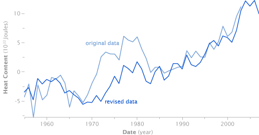
The same flaws in the XBT data that affected Willis’ ocean heat maps showed up in the long-term historical trend (light blue). After applying a correction, the historical record shows a relatively steady increase in line with what’s shown by climate models. The remaining short-term variability is as likely to be natural variation, such as El Niño, as noise in the data. (Graph by Robert Simmon, based on data from GODAR.)
Correcting the Record
https://earthobservatory.nasa.gov/Features/OceanCooling/page5.php
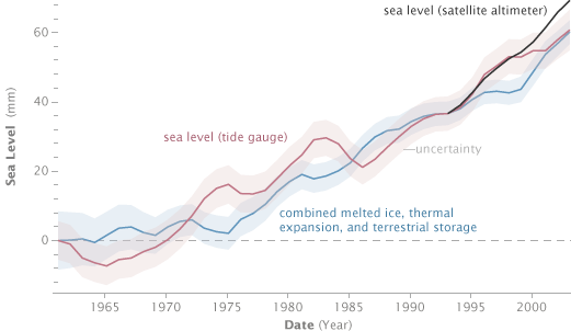
In principle, it should be possible to add up each of the individual components of sea level rise—melting continental ice sheets in Antarctica and Greenland, retreating glaciers, the thermal expansion of near-surface water, thermal expansion of the deep ocean, and changes in water storage on land—to calculate the total rise over time. Unfortunately, early attempts to balance the sea level budget never added up. Each line on this graph shows how many millimeters each process added to or subtracted from total sea level since the early 1960s. (Graph adapted from Domingues 2008.)
