Station Drop Out
Many in the denialist camp like to talk about the fact that many temperature reading stations were taken out, and that is why the temperature readings showed global warming. But in reality, this is “Pure disinformation”. According to Gavin Schmidt (NASA/GISS) “You can do the same analysis with only stations that remained and it makes no difference.”

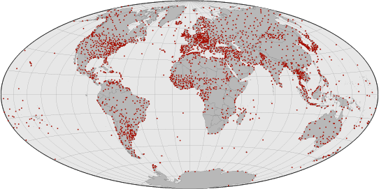
Global Weather Stations Map
From CNN interview: Jan. 13 2009
LOU DOBBS
The global temperatures by NOAA are seven of the eight warmest years on record have occurred since 2001. The ten warmest years have all occurred since 1995. So let me start, if I may, Joseph, your reaction to those numbers. Do you quibble with what they represent?
D’ALEO:
“Yes, I do. In fact, if you look at the satellite data, which is the most reliable data, the best coverage of the globe, 2008 was the 14th coldest in 30 years. That doesn’t jive with the tenth warmest in 159 years in the Hadley data set or 113 or 114 years in the NOAA data set. Those global data sets are contaminated by the fact that two-thirds of the globe’s stations dropped out in 1990. Most of them rural and they performed no urban adjustment. And, Lou, you know, and the people in your studio know that if they live in the suburbs of New York City, it’s a lot colder in rural areas than in the city. Now we have more urban effect in those numbers reflecting — that show up in that enhanced or exaggerated warming in the global data set.”
GAVIN SCHMIDT NASA/GISS
“D’Aleo is misdirecting through his teeth here. He knows that the satellite analyses have more variability over ENSO cycles than the surface records, he also knows that urban heat island effects are corrected for in the surface records, and he also knows that this doesn’t effect ocean temperatures, and that the station dropping out doesn’t affect the trends at all (you can do the same analysis with only stations that remained and it makes no difference). Pure disinformation.
Source: 2009 CNN is spun right round baby right round.
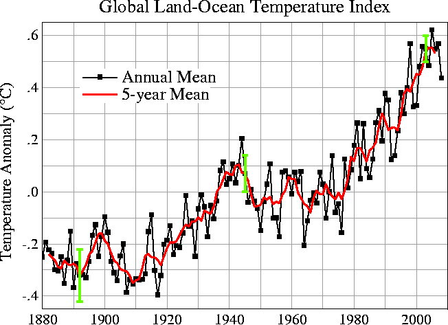
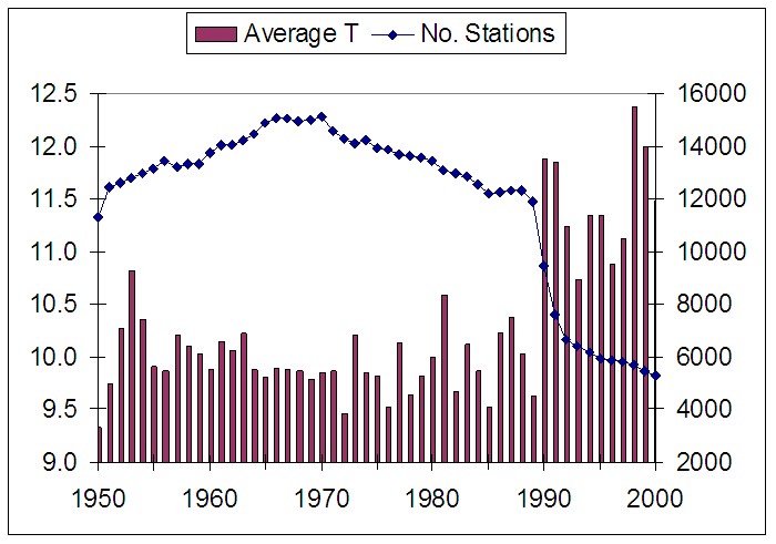
Compare the fake chart apparently made by Ross McKitrick (inspired by Joe D’Aleo from icecap.us) to the NASA global temperature chart. Notice there is not bump in temperature in the NASA graph. The McKitrick graph is fake, it does not show temperature rise.
McKitrick: “In the spreadsheet I used to generate the graph I construct the average temperature as weighted by the number of stations in each group.”
In other words, he is creating a calculation that shows in the graph that the weighting changes the numbers representing temperature. Confused yet? Let’s clear up the picture. If you weight the average temperature with the number of stations in each group, you are no longer showing temperature, you are showing a made up number that has nothing to do with temperature, it’s just a made up number. Conclusion: the graph is a misrepresentation.
This type of abstraction is common in conspiracy theorists and Mr. McKitrick may for his next trick want to show us all how the moon landing was faked in a Hollywood studio, how smoking is not dangerous to human health, or how the ozone hole was just a made up problem to scare everyone into thinking we needed to control pollution?
McKitrick/D’Aleo Graph
From the EPA site:
Comment (1-63):
The Southeastern Legal Foundation, in their Third Amendment to Petition, discussed the issue of “station drop-out” at length:
“Station drop-out” refers here to the precipitous decline in the number of temperature records included in the GHCN dataset. In the 1970’s more than 6000 stations were active. Today the figure is 1500 or less. D’Aleo & Watts, p. 10, n. 94 The following graph, prepared by Ross McKitrick5 shows the relationship between station drop-out and average temperature, where “Average T” is a mean of raw unprocessed temperature data, and No. of Stations.
D’Aleo & Watts, p. 11. See https://www.uoguelph.ca/~rmckitri/research/nvst.html
(last visited Feb. 10, 2010) for a full explanation of this chart, and access to data it represents. This chart shows that the station drop out coincides with a sharp and significant increase in average raw temperature, and thus suggests that the change in temperature is the result of sampling bias and not climate change.
The stations that were dropped were disproportionately rural. D’Aleo & Watts, p. 11-12. Further, the remaining stations were biased towards lower latitudes, lower elevations, and urban locations. Id., citing E.M. Smith6, https://chiefio.wordpress.com/2009/11 /03/ghcn-the-global-analysis/
(last visited Feb. 10, 2010). All of these tendencies away from random sampling impart a warm bias to the record. D’Aleo & Watts show that station drop out has occurred all over the world, but the greatest station drop-out has occurred in Siberia and Canada, where these global temperature datasets purport to show the greatest warming has occurred.
Response (1-63):
In the previous response, EPA addressed petitioners’ allegations that weather station dropouts have led to a warming bias in the temperature record. As described above, 1) petitioners rely on a non-peer-reviewed source that contains a number of inaccurate statements and relies on a scientifically flawed analysis; 2) petitioners demonstrate a fundamental misunderstanding of how to determine a warming or cooling trend from a temperature record and what issues actually would lead to either a warming or cooling bias in that record; and 3) petitioners fail to acknowledge that climatic records other than land surface temperature records also show clear warming trends consistent with the trend shown by the surface temperature data.
The graph submitted by the petitioner shows the absolute temperature averaged across all the stations existing at any given point in time, which has no real physical meaning—proper analysis averages the changes of station temperatures across a set of stations. Additionally, the analysis should take into account station location when making global average rather than weighting every station equally. Equal weighting tends to introduce a bias by overweighting regions with many stations.
NASA Global Mean Temperature Chart

Links
- NASA Earth Observatory: Earth’s Temperature Tracker
- NASA Earth Observatory: Earth, it’s Cooling… no it’s warming
- NASA Earth Observatory: The Data & The Details
- NASA Earth Observatory: From A Dimmer Past to a Brighter Future?
- EPA Denial of Petition
- Related content
- Ross McKitrick – The McKi ‘trick’
Document Actions

