Keeling Curves
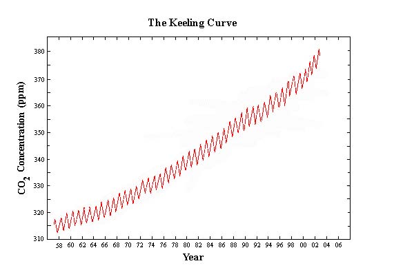
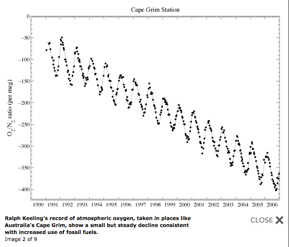
Most understand the Keeling curve as an upward trend of CO2 in the atmosphere as measured by the Mauna Loa measurements of Charles David Keeling. But there are two Keeling curves and they are related to each other in more than one way. While CO2 increases, it stands to reason that O2 will decrease (C + O2 = CO2). The two curves also have family ties.
The Keeling Curve up to 2002
The Keeling curve based on the Mauna Loa CO2 measurements started by Charles David Keeling in 1958. The measurements have proven to be significant in showing the rate of CO2 increase in the atmosphere. It was the first chart of its kind to show the direct impact of human activity in the atmosphere.
Ralph Keeling, Director of the CO2 program at Scripps Institute of Oceanography, is the son of Charles David Keeling. Father and Son back in the 1980’s discussed the probability of the relationship between CO2 rise and oxygen depletion.
The coincidence of the two Keeling curves are yet another method of confirmation of the link between human industrial CO2 output and the changes in atmospheric composition combined with the recent upward trend in the Global Mean Temperature.
The Keeling Curve
Scripps Institute of Oceanography, UCSD (June 6, 2008)
The Ralph Keeling Curve
Above graph key indicates ‘per meg’ units
“The simple explanation is that a loss of 100 per meg corresponds to losing 100 O2 molecules out of every million O2 molecules in the atmosphere. The scale reflects the changes in oxygen since a period in the mid 1980s, hence the negative values.”
– Ralph Keeling
While oxygen depletion sounds intimidating, the reality is that it is only a small fraction of the total atmospheric oxygen and not considered consequential. But it is important. Seeing the oxygen depletion helps confirm the human factor involved in the increase of CO2. Also, any changes in other systems that relate to atmospheric oxygen can be seen in or confirmed by the atmospheric oxygen levels.


