NASA Satellites Detect Pothole on Road to Higher Seas; Summer 2011: Arctic sea ice near record lows, Conditions in context, September 2011 compared to past years, Atmospheric conditions, Sea surface temperatures, Ice remains younger/thinner; The cost of ‘wait & see’; Skeptic Richard Muller Funded in part of Koch Brothers finds Global Warming is Real; The Judith Curry Mistake.
Nearly 5% of oldest Arctic ice remains.
October 4, 2011
Summer 2011: Arctic sea ice near record lows
The summer sea ice melt season has ended in the Arctic. Arctic sea ice extent reached its low for the year, the second lowest in the satellite record, on September 9. The minimum extent was only slightly above 2007, the record low year, even though weather conditions this year were not as conducive to ice loss as in 2007. Both the Northwest Passage and the Northern Sea Route were open for a period during September.
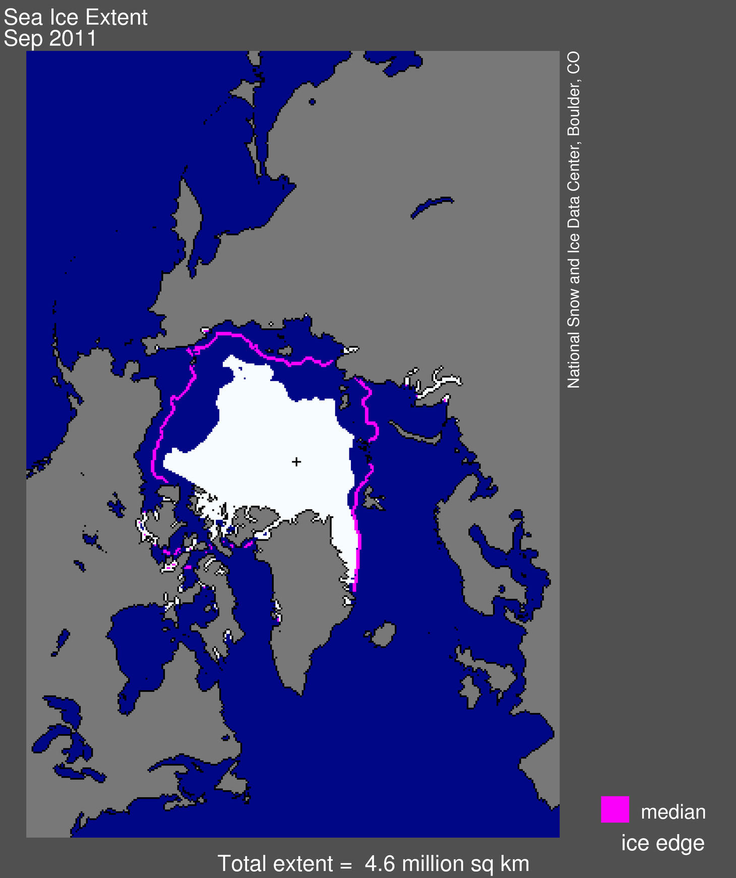
Figure 1. Arctic sea ice extent for September 2011 was 4.61 million square kilometers (1.78 million square miles). The magenta line shows the 1979 to 2000 median extent for that month. The black cross indicates the geographic North Pole. Sea Ice Index data.
Please note that our daily sea ice images, derived from microwave measurements, may show spurious pixels in areas where sea ice may not be present. These artifacts are generally caused by coastline effects, or less commonly by severe weather. Scientists use masks to minimize the number of “noise” pixels, based on long-term extent patterns. Noise is largely eliminated in the process of generating monthly averages, our standard measurement for analyzing interannual trends. Data derived from Sea Ice Index data set. —Credit: National Snow and Ice Data Center
Overview of conditions
Average ice extent for September 2011 was 4.61 million square kilometers (1.78 million square miles), 2.43 million square kilometers (938,000 square miles) below the 1979 to 2000 average. This was 310,000 square kilometers (120,000 square miles) above the average for September 2007, the lowest monthly extent in the satellite record. Ice extent was below the 1979 to 2000 average everywhere except in the East Greenland Sea, where conditions were near average.
As in recent years, northern shipping routes opened up this summer. The Northern Sea Route opened by mid August and still appeared to be open as of the end of September. The southern “Amundsen Route” of the Northwest Passage, through the straits of the Canadian Arctic Archipelago, opened for the fifth year in a row. Overall, sea ice in the wider and deeper northern route through Parry Channel reached a record low, according to Stephen Howell of Environment Canada, based on Canadian Ice Service analysis. Parry Channel had a narrow strip of ice that blocked a short section of the channel, but it did appear to open briefly in early September.
For additional numbers for previous years, see Table 1.
—Credit: National Snow and Ice Data Center
High-resolution image
Conditions in context
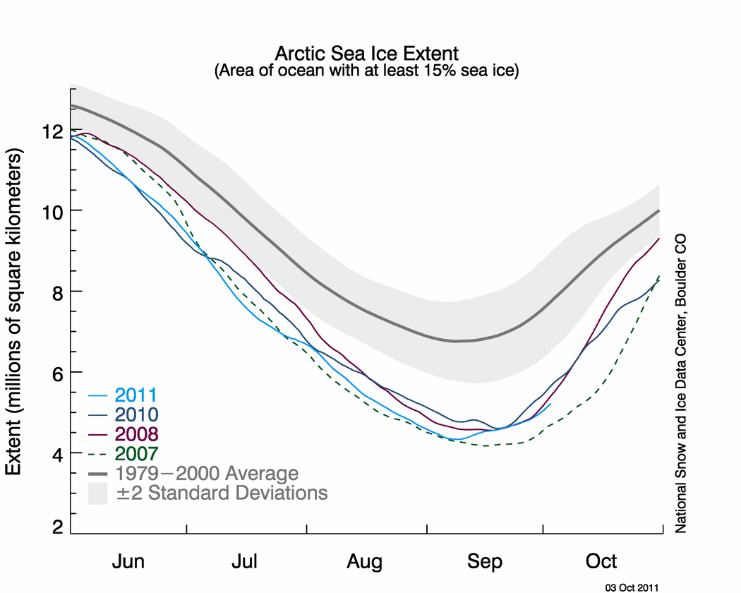
While the melt season in 2011 got off to a slow start, the ice loss pace quickened during June. Ice retreated quite rapidly in the Kara and Barents seas, with rates more than double the average rate. Rapid ice loss continued during the first half of July but then slowed considerably as a series of low pressure systems moved over the central Arctic Ocean. By the end of July, ice extent was slightly above that seen in 2007.
Ice extent stayed above 2007 for the remainder of the melt season, reaching its minimum of 4.33 million square kilometers (1.67 million square miles) on September 9, 2011. Since the minimum, a rapid freeze-up has begun. On October 1, the five-day average extent rose above 5 million square kilometers (1.93 million square miles).
—Credit: National Snow and Ice Data Center
High-resolution image
September 2011 compared to past years
Ice extent for September 2011 was the second lowest in the satellite record for the month. The last five years (2007 to 2011) have had the five lowest September extents in the satellite record. The linear rate of decline is now -84,700 square kilometers (-32,700 square miles) per year, or -12% per decade relative to the 1979 to 2000 average. In contrast to 2007, when a “perfect storm” of atmospheric and ocean conditions contributed to summer ice loss, this year’s conditions were less extreme. From the beginning of the melt season in March, to the minimum extent on September 9, the Arctic Ocean lost 10.3 million square kilometers (4.0 million square miles) of sea ice. It was the fifth year in a row with more than 10 million square kilometers of ice extent change from maximum to minimum. In comparison, the average seasonal ice loss during the 1980s was 9.0 million square kilometers (3.5 million square miles)
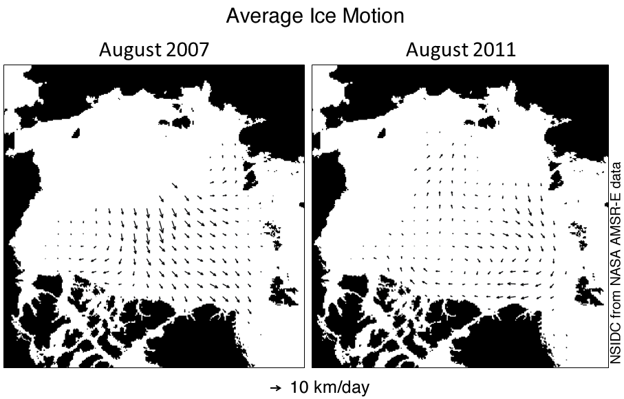
Figure 4. Ice motion charts for August 2011 show different movement patterns for this summer compared to 2007. The arrows show the direction of ice motion, with larger arrows indicating stronger motion. In 2007, northward ice motion helped push the ice together and flush it out of the Arctic.
—Credit: National Snow and Ice Data Center
High-resolution image
Atmospheric conditions
In 2007, a persistent dipole anomaly weather pattern, with unusually high pressure over the Beaufort Sea and unusually low pressure over the Kara Sea, helped contribute to the record ice loss. This pattern resulted in strong southerly winds from the Bering Strait region across the North Pole, which brought warmer winds and ocean waters northward to melt the ice edge and push the ice northward. In addition, especially strong high pressure over the Beaufort and Chukchi Seas in June 2007 resulted in less than average cloudiness, allowing more sunlight to reach the ice.
The Arctic saw a similar weather pattern this summer, but not as strong and persistent as in 2007. The location of the high and low pressure centers was also shifted, so that the winds blew east to west instead of toward the north as in 2007. This shift is reflected in the movement of the sea ice, particularly during August.
Patterns of air temperatures (measured at the 925 millibar level or about 1,000 meters or 3,000 feet above the surface) were also quite different this year compared to 2007. In summer 2007, temperatures in the Beaufort and Chukchi Seas were 5 degrees Celsius (9 degrees Fahrenheit) above average. This year, temperatures in that region were near average, but north of Greenland and in the Canadian Archipelago, conditions were even warmer than in 2007. These high temperatures likely played a role in the opening of the Northwest Passage.
—Credit: NSIDC courtesy M. Steele and W. Ermold, Univ. Washington PSC, and NOAA
High-resolution image
Sea surface temperatures
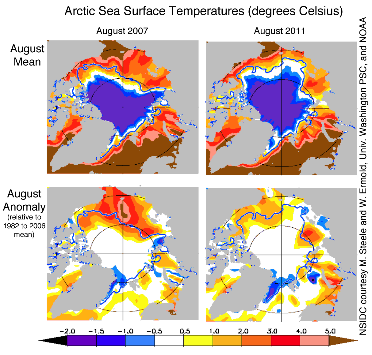
Ocean sea surface temperatures (SSTs), based on National Oceanographic and Atmospheric Administration (NOAA) data provided by Michael Steele and Wendy Ermold of the University of Washington Polar Science Center, indicate above normal temperatures on the surface of the Arctic Ocean. However, the temperatures anomalies were not as extreme as in 2007 and were comparable to those recorded for 2009 and 2010. These lower temperatures may be the result of less solar heating of the exposed ocean surface or less transport of warm waters from the south. In 2007, ice retreated early from the shores of Alaska and Siberia, allowing the ocean mixed layer to heat up and enhance melting of the ice from below. In contrast, ice was slower to retreat in this region in summer 2011, and less bottom melt was observed.
—Credit: National Snow and Ice Data Center courtesy J. Maslanik, C. Fowler, and M. Tschudi, U. Colorado Boulder
High-resolution image
Ice remains younger, thinner
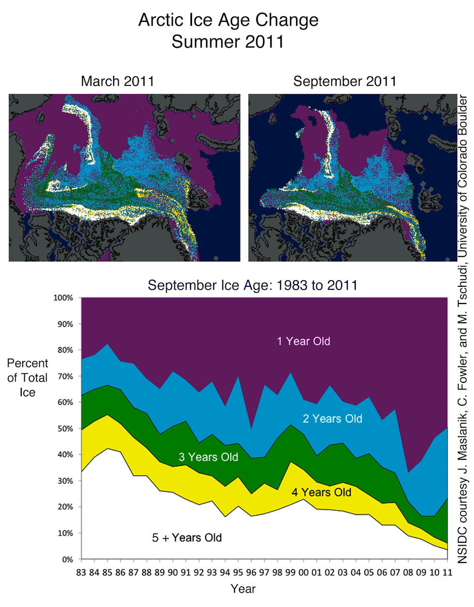
Why did ice extent fall to a near record low without the sort of extreme weather conditions seen in 2007? One explanation is that the ice cover is thinner than it used to be; the melt season starts with more first-year ice (ice that formed the previous autumn and winter) and less of the generally thicker multi-year ice (ice that has survived at least one summer season). First- and second-year ice made up 80% of the ice cover in the Arctic Basin in March 2011, compared to 55% on average from 1980 to 2000. Over the past few summers, more first-year ice has survived than in 2007, replenishing the younger multi-year ice categories (2- to 3-year-old ice). This multi-year ice appears to have played a key role in preserving the tongue of ice extending from near the North Pole toward the East Siberian Sea. However, the oldest, thickest ice (five or more years old) has continued to decline, particularly in the Beaufort and Chukchi Seas. Continued loss of the oldest, thickest ice has prevented any significant recovery of the summer minimum extent. In essence, what was once a refuge for older ice has become a graveyard.
Table 1. Previous Arctic sea ice extents for the month of September
| Year | Average Arctic Sea Ice Extent for September | Trend, in % per decade (relative to 1979-2000 avg.) | |
|---|---|---|---|
| in millions of square kilometers | in millions of square miles | ||
| 2007 | 4.30 | 1.66 | -10.2 |
| 2008 | 4.67 | 1.80 | -11.1 |
| 2009 | 5.36 | 2.07 | -11.2 |
| 2010 | 4.90 | 1.89 | -11.6 |
| 2011 | 4.61 | 1.78 | -12.0 |
| 1979 to 2000 average | 7.04 | 2.72 | |
| 1979 to 2010 average | 6.52 | 2.52 | |
NASA Satellites Detect Pothole on Road to Higher Seas
Edited: 2011-08-23
Our colleagues at JPL have also been interested in how the global mean sea level is affected by the ENSO (i.e., El Niño and La Niña). They find that GRACE measurements helped to identify the distribution of abnormally high rainfall over land resulting from the recent strong La Niña. This temporary transfer of large volumes of water from the oceans to the land surfaces also helps explain the large drop in global mean sea level. But they also expect the global mean sea level to begin climbing again.
An Update from NASA’s Sea Level Sentinels:
Like mercury in a thermometer, ocean waters expand as they warm. This, along with melting glaciers and ice sheets in Greenland and Antarctica, drives sea levels higher over the long term. For the past 18 years, the U.S./French Jason-1, Jason-2 and Topex/Poseidon spacecraft have been monitoring the gradual rise of the world’s ocean in response to global warming.
While the rise of the global ocean has been remarkably steady for most of this time, every once in a while, sea level rise hits a speed bump. This past year, it’s been more like a pothole: between last summer and this one, global sea level actually fell by about a quarter of an inch, or half a centimeter.
So what’s up with the down seas, and what does it mean? Climate scientist Josh Willis of NASA’s Jet Propulsion Laboratory, Pasadena, Calif., says you can blame it on the cycle of El Niño and La Niña in the Pacific. [Read more…]
2011_rel2: GMSL and Multivariate ENSO Index

Discussion
The Multivariate ENSO Index (MEI) is the unrotated, first principal component of six observables measured over the tropical Pacific (see NOAA ESRL MEI, Wolter & Timlin, 1993,1998). To compare the global mean sea level to the MEI time series, we removed the mean, linear trend, and seasonal signals from the 60-day smoothed global mean sea level estimates and normalized each time series by its standard deviation. The normalized values plotted above show a strong correlation between the global mean sea level and the MEI, with the global mean sea level often lagging changes in the MEI. Since the MEI has recently sharply increased (coming out of a strong La Niña), we expect the global mean sea level estimates to also reverse their recent downward trend and begin to increase as the La Niña effects wane.
The Cost of ‘Wait and See’
https://www.climatecentral.org/blogs/wedges-reaffirmed/P2
https://www.realclimate.org/index.php/archives/2011/10/the-cost-of-inaction/
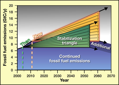
Some say we should just wait and see what happens with global warming. In consideration of the costs and impact potentials it is becoming increasingly clear through both quantitative and qualitative analysis that inaction has a increasingly higher costs if unattended.
Is there a way to assess the cost of inaction on reducing carbon emissions? Yes. When you combine the data regarding crop loss and changes in precipitation, soil moisture content and fresh water supply impacts you can more clearly see that the impacts will undoubtedly have a negative economic impact.
When you combine that value consideration with the impacts of fire and drought and how the total combined effect will resonate throughout the economic food chain it is obvious that the net result of ‘wait and see” is negative with a high risk potential. While some claim that the science of climate is too uncertain, they are missing the main point that certainty on the most critical aspects of the science are above 90%. The can claim uncertainty in cloud response which is still scientifically challenging, but there is not evidence to support that there will actually be a negative response. The paleo evidence indicates there is no detectable ‘Iris’ effect.
The conclusion one can draw is that the evidence outweighs the ‘Iris hypothesis’. The paleo evidence and the modern physics and observations indicate that there will warming will result from increased greenhouse gases. The only reasonable conclusion one can come to based on the evidence is that one can not use mere hypothesis to override the risk values estimated by continued emissions at current rates. To ‘believe’ otherwise would be similar in nature to governments making decisions based on wishful thinking as opposed to observed evidence that has been strongly confirmed. It simply does not make sense.
Skeptic Muller Funded in part of Koch Brothers finds Global Warming is Real
By John P. Reisman Oct. 31, 2011
There was nothing new or surprising in Richard Muller’s (unpublished) work. His main concern was there was not enough skepticism prior to ‘his’ work? It is a bold claim and I am reasonably sure that most of the scientists that have been working in the field would argue with him on that point.
Essentially he was saying that ‘he’ would not be convinced until ‘he’ examined the data and that ‘he’ would not trust the work of expert climate scientists.
There is no revelation in his work. Global warming was predicted as early as 1896 by Svante Arrhenius and further confirmed through the work of many scientists over decades of research including Callendar, Plass, Revelle, Keeling, Hansen, and in recent decades thousands of scientists and hundreds of research universities and institutions.
Muller work at best only reiterates what is already known, the world is warming. ‘His’ confirmation was not needed, though not unwelcome. The fact that he was funded by the Koch Brothers is only mildly interesting and has public merit. Until published, his work will likely not be formally criticized to see if his methods were sound.
The problem remains, he did not delve into the human cause issue. He may still be skeptical on cause but did say “Greenhouse gases could have a disastrous impact on the world”. Yet he contends that the threat is not as proven as the Nobel Prize-winning Intergovernmental Panel on Climate Change says it is? How can he make such a contention without researching it though? This is yet another example of scientists opinion reaching beyond the scope of their work and view making unsubstantiated claims.
What is indicated is that he does not trust the field of science until he personally verifies it. It’s odd though. He knows the scientific method is being used in climate science. It seems he merely does not trust science, or science done by anyone other than himself. My question then to Richard Muller is, does he fly in airplanes, and if he does, does he ask the pilot to let him fly the plane so that he knows everything is being done correctly… even though he’s not proficient in piloting the aircraft?
His statements lean toward arrogance and his skepticism seems inappropriate as it seems overly skeptical of the very foundations of science itself, the scientific method. It seems that in his view, the quality of so many thousands of scientists can not be trusted until Richard Muller puts his stamp of approval on it?
This fact remains: The basic physics and knowledge of the greenhouse effect have been examined since 1824 beginning with Joseph Fourier, the hypothesis that we should warm with continued CO2 emissions has been around for more than a hundred years, the general confirmations and realization that this will develop into a global problem have been germinating for over 50 years, and in the last three decades the knowledge that the warming we will experience will affect our climate and agricultural systems is well known with high confidence levels.
Muller has added nothing new to our collective understanding or that of the science of climate, other than inform us that there are still some overly stubborn scientists that don’t believe anything until they see it with their own eyes. I can understand this only to a degree as I myself sometimes fall into this category. But there is a difference between being skeptical and drawing conclusions that a field of science is not strong based on my not understanding it (non sequitur). It’s okay to be skeptical. It’s not okay to say the climate scientists are wrong just because I have not looked deep enough into the issue. Muller apparently fell into the latter category. As for my self, it’s okay for me to not understand a finding until looking deeper, but neither I nor others should make broad-based assumptions and claims that the science should be doubted based on our own lack of understanding.
I conclude with this thought. There is healthy skepticism and there is arrogant skepticism. The evidence suggests that Richard Muller falls somewhat into the arrogant skepticism side of the equation.
In summary, if nothing scientific can be trusted until Richard Muller tests it, then he’s going to be a very, very busy man for the rest of his life.
Source link for background on story.
The Judith Curry Mistake
By John P. Reisman Oct. 31, 2011
Dr. Judith Curry continues to misinterpret long term climate trends by focusing on irrelevant time periods (too short). She has been informed by many highly competent scientists that are apparently much more qualified than herself in how to separate the short term natural variation from the human change signal based on changes and influences of increased radiative forcing. The key to relevant context for examination of the data/trend is time. Generally you need at least three decades of change combined with attribution including human and natural factors in order to see (separate) the significance of the human signal from natural variation.
She apparently continues to ignore this reality and point to data segments that are too short to separate the natural variation from the human influenced trend signal. Why would a scientist continue to ignore these well known realities? Let us consider the possibilities:
- Curry’s view is subject to confirmation bias
- Possibly there is some as yet unseen special interest influence
- Curry has become a victim of her own tribe mentality problem/hypothesis
- Dr. Curry is not sufficiently knowledgeable in the field of climate science to express a competently informed view
It is possible, if not likely, that one or more of these factors are in play with Dr. Curry’s continued focus on irrelevance. Either way, she exemplifies inadequacy in interpretation of the available evidence.

